How to Pick a Good Photographer | Rhode Island Family Photography
Author’s Notes: Since this is still getting a lot of views, far more than I ever imagined… This was written as a guide for regular, normal people all across the country who plan to spend money on photographs of their family. There are phenomenal photographers out there who are NOT in business. But if you are spending money for photographs, these are a few things to keep in mind when looking. And yes there are AMAZING beginning, new photographers in the market who might charge less. The idea at the end of all of this is to get clients to RECOGNIZE those people when they see them. Also, yes, this has my opinions, especially in the first paragraph. I wrote it, so of COURSE it has my opinions! 🙂 (And no, to the person who asked, I have not forgotten where I started!) What are not my opinions however are what a large majority of photographers consider what comprises good photographs. Also, some people have commented that it would have been more effective had I used other people’s photographs. I agree but was told by several people when vetting this article to use my own. Plus in the end it was easier to manipulate my own images since I had the original RAW files to work with. Many of these shots are SOOC (straight out of the camera) shots meaning they have not been edited.
Another excellent viewpoint that has since been written, perhaps more eloquently is by a photographer I greatly admire – Andrea Joki. Her opinion can be seen HERE
I’ve been writing this post in my head for quite a while now and I’ve finally gotten it out on “paper” (which only took me a month). So grab a cup of coffee and a snack and sit down to read. It’s a long one! Or print this out (or email me for a copy if you’d like).
There are so many people who are going into business as photographers out there, especially nowadays with the economy. People spend some money, get a camera, someone tells them that their photos are good and they start to see it as an easy way to make money and hang out their shingle. As a result, lots of people who are looking for photos for their children and families are, essentially, wasting money on photographers who will not turn out the product that they deserve. Now, no one ever said that custom GOOD photography is cheap. It’s NOT. And you know what, IT SHOULDN’T BE. (There are so many costs involved in running a photography business, but that is a post for another time.) You often get exactly what you pay for and if a photographer’s prices sound too good to be true, then they often are. Photographs are SO important; it is worth the investment. Think very carefully and choose very wisely before you spend your time or money or, most importantly, memories and moments on someone whose photographs are not going to be what you want. I feel strongly enough about this to say that if you cannot afford a GOOD on-location or studio photographer I would rather you go to a chain studio where at least the people are trained in some way. (Author’s note: Pricing will 100% admittedly vary based on where in the country you are and your area’s cost of living.)
Now with all that being said, I have come to the realization that a lot of people honestly cannot recognize bad photography when they see it. People recognize good photography. It is easy to look at a website and just *know* that the photography is AMAZING. But it’s difficult for some people to look at websites and know that the photography is Just. Not. Good. So in this post I have put together a few things to help you pick out a good photographer. Keep these things in mind when you are looking for someone for YOUR photos. Examine their portfolio with a critical eye. Don’t just go to someone because your friend did. Look at their website and work for yourself and decide. It is NOT easy to find a truly good photographer; like anything else you are shopping for, you need to know what you are looking for.
I am going to give you a few specifics below to help you in your search. Before we start though, one very important thing to keep in mind – these things should not be taken individually and used to dismiss a photographer. Take them as a group of things to look for and avoid. I know fabulous photographers who use tilts or love funky color processing. There is REALLY something to be said for artistic freedom and processing. It comes back to what I said at the beginning – we easily recognize AMAZING and if the basic underlying work is amazing then the “rules” that I have listed below are being intentionally broken and the photographers know exactly what they are doing. But if you are looking at a photographer who has a bunch of these issues in his or her portfolio, you are probably better off avoiding that person if you are choosing someone to invest a lot of money in. I have included examples where I could. These examples have been provided by some wonderful friends 🙂 or are some of my own manipulated to make my points.
I. Lighting — Light and knowing how to use it.
A good photographer knows how to work with all kinds of lighting situations. They can shoot morning, evening, midday and turn out beautiful images. Not blown out images or super dark images. There should be color and depth to their images. What they should NOT have in their portfolio:
- Overexposure – Blown highlights, splotchy parts of photographs, when there is a loss of detail in the light parts. These are not “artistic” things. This is overexposing a photograph. Now granted, there are photos where this happens in order to properly expose the main subject but those should be few and far between in your photographer’s portfolio
- Underexposure – When a photograph is dark. There is a loss of detail and colors are flat.


- Flatness – When there is no depth to the colors, they are flat. The picture loses vitality and shows the photographer’s lack of ability to use the light. There should be a wide range in the tones of greens / reds / colors.

- Too much contrast / saturation – the opposite of flatness. When the colors are too saturated. We’ve all seen the photos where the colors almost glow. Where it hurts your eyes (as a clue, if you are looking and the colors make you squint, move on). Or where the colors are just SO intense especially in skin tones. A good photographer knows how to properly work with colors and work with both the light and the editing software afterward. In this photo her shirt practically glows, the picture is neon and the skin tones are INCREDIBLY over-saturated. (And yes this another photographer who really processed it this way and gave it to me for my example.)

- Color Casts / White Balance – There is a style of editing out there called Lily Blue. It is a beautiful action that a lot of people use when editing photos. It gives the photo a soft hazy tint of color, almost a retro effect. My friend Nicole is an expert at it. There is gorgeous artistic photography that uses colors and color washes perfectly. You can see an example of this in Nicole’s work by clicking HERE and scrolling through her posts. There is fun wonderful beautiful funky color photo editing that can be done. This is a sample of something that you might see that uses artistic color processing:

HOWEVER, there is also photography that shows that the photographer just does not know how to use light. We’ve all seen photographs where babies are grey, where people look like oompa loompas (think old school Willy Wonka with the orange men). Where photos as a whole just look yellow or red or blue. These are a result of not knowing how to get a proper white balance with your lighting. If you see gray babies or blue skin or orange skin or yellow-yellow hair, run far and fast the other way. Here is an example of what we would call “Oompa loompas” and blue babies…and then how it should normally look. (These photos have not been fully edited, they are here strictly to show good white balance)
II. Composition — how a photograph is set up in camera
There is good composition and there is bad composition. There are also compositions that break the rules intentionally. Look for good and strong compositions by the photographer in their portfolio. They should NOT have a lot of these:
- Soft, Out of Focus photos – They should not have ANY of these on their site. Photos should not be soft or out of focus. They should be crisp and clear. Like you are looking through a polished window. In a close-up portrait, the eyes should always be sharp (unless they are intentionally focusing on something else). Something like this is not good:

- Tilts – Have you ever looked at a photo that either made you turn your head, fear that the subject was going to fall over or get dizzy? Yeah. That’s too much tilting. If your photographer is constantly tilting every photo, that’s not good. Usually it’s a sign that they didn’t compose the photo well in camera and made do with a funky tilt. Now, there is also good tilt. Tilting can really enhance the photo – in the below photo I did a bit of a tilt to show the massive size of the door the girls were sitting on.

And in this one, I did it to bring her eyes into the part of the frame I wanted and to give the impression that she was coming towards the viewer.

- Centering – there is something to be said for a good quality centered photo. But a photographer that you are paying good money for should not be centering Every. Single. Photo. There are (surprisingly to some) rules to centering a photo. There should be leading lines, meaning something the eye follows to the middle, or a frame within a frame, meaning the subject is framed by something else in the photo. Make sure they aren’t just centering everything for the sake of centering. There should be a variety of compositions and placements of subjects in their portfolio
- Not Visually Interesting – how many photos just aren’t interesting? Not all photos need eye contact with the lens (in fact many of mine don’t!) but they need to draw you in. Make you smile, make you cry, make you think, interest you in some way. There is NO interest here. And by the way, this would also be an example of BAD tilt.

III. Conversions — how a photograph is converted from color to black and white
I’m not going to discuss sepia toned photographs here simply because I don’t do them; I am not a huge fan of them except for in certain images (but THIS is an example of a good one). Neither will I really touch the selective color photographs as much as I really REALLY itch to do so. Selective color is when most of the photo is in black and white except for a certain part. I will only say that it is an outdated technique and should be reserved for fine art use and an occasional wedding shot.
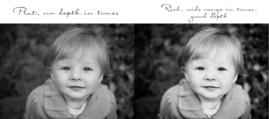
- Black and Whites – Black and white photographs should have a wide tonal range. Meaning from lights to darks with many shades in between. It should have shadows, it should have highlights and it should have all sorts of tones in between as well. It should have visual depth to it. It should not be flat. It should not be what we term “muddy” – with clusters of grainy looking black shadows. It should not have splotches. Quality black and whites are a huge consideration for me. It shows that not only did the photographer know how to get a good color photograph originally, but that they also know how to work with editing software and that they can recognize good and bad conversions. There are what are called high-key conversions where it is a super light and airy image. And there are low-key moody conversions where it is a darker image, but well done dark, not blotchy grainy yucky dark.


IV. Business
The business side of things:
- Do they have a valid business license? What about a sales tax permit?
- In an ideal world, is your photographer a member of any national organizations such as Professional Photographers of America? They should be a dues-paying member of AT LEAST one national / international organization. In a perfect world they will also have that information stated on their website but you can ask! (I have changed this from the original wording because I have reconsidered. Personally I think they *should* belong to an organization but not everyone does)
- Do they have a tax id?
- Is their website professional and easy to navigate? Are there spelling errors, grammatical errors, etc. Anyone can buy a fancy website, but is it put together with thought and time and effort? Can you read all of the text? Does it look like they just typed it up and never looked at it again? Is it updated with current work?
- Do they pay federal and state taxes?
- Is the music they are using on their site legal and licensed? (ETA: This applies for the US only. Other countries have other copyright laws, which I neglected to mention.)
- This is a pet peeve of mine especially since photographers work in a world where copyright is huge. There are songs I would love to use on my website. But licensing popular music can run into the tens of thousands of dollars. (Example – the Hawaiian version of Somewhere Over the Rainbow costs upwards of $50,000 to license!) Now some photographers have paid good money for their music, but a lot of them, no. And that is what we call illegal, stealing and copyright infringement. If you’re not sure, ask them if they licensed their music.
- This is a pet peeve of mine especially since photographers work in a world where copyright is huge. There are songs I would love to use on my website. But licensing popular music can run into the tens of thousands of dollars. (Example – the Hawaiian version of Somewhere Over the Rainbow costs upwards of $50,000 to license!) Now some photographers have paid good money for their music, but a lot of them, no. And that is what we call illegal, stealing and copyright infringement. If you’re not sure, ask them if they licensed their music.
A quick word about Studio Photography.
Anyone who knows my work knows that I do NOT do studio work. I am not a fan personally of the look for my photos. BUT I can recognize and appreciate good studio work and bad. A few quick clues. If you can see wrinkles in the backdrop, if the child looks like they were thrown on a blanket, it’s not good (look back at that contrast photo – that is NOT good). The backdrop and props (if any used) should enhance the photos and blend into the background, not distract from it. And lighting is INCREDIBLY key in studio. It should give depth and shadows and definition to the subjects and the photo – it should not be flat. If you would like to see an example of what studio shots should look like, I strongly suggest you check out one of my favorite studio photographers – Lori from Center Stage Photography. Her work is what every studio photographer should aspire to.
So that is pretty much it. Take or leave as much of it as you want. If you are another fellow photographer, agree or disagree. Hopefully, though, you have learned something and can use this to help you in your own search for a photographer.
Great post Amy! I’m definitely going to share it!
Awesome article!
Great post Amy, and very relevant since so many people are trying to get into this business….
Great post Amy! And very relevant since so many people are trying to get into this business…
AWESOME post, Amy!! A lot of thought went into this and you nailed every part of it!!
Great Article, one that everyone, including photographers should read.
Very well-written! I’m going to share it too!
Great post Amy!
Excellent post, Amy! Sorry. I have to ask…is the baby in the contrast/saturation example real?! It looks like a really scary doll!
I’m glad you called me your friend 😉 bad photography cute baby!!?
Seriously, thanks this is awesome!
Great post Amy! Thanks for taking the time to write all that out.
Pingback: Denver Wedding Photographer | How to pick a good photographer | keridoolittlephotography.com
Amy–GREAT topic! I wish I had had something like this before wedding photog shopping!
Great post, Amy! Thank you for writing all that out and getting all those example photos. Hopefully people will learn from this! Would you mind if I shared this on my blog for my clients? (with a link back to you, of course!)
Pingback: EAST BAY FAMILY PHOTOGRAPHER | Let’s hang out on Happy People Lane » Nicole Fields
Great post, Amy! Thanks for sharing your knowledge!
fabulous post and well written! I agree 1000%!
AWESOME POST! There are hundreds of people out here that think they are amazing photographers, I am by no means the best, but I agree with everything in this post, and I am trying my hardest to learn and better myself through classes, workshops, tutorials, etc.. I have loved and practiced photography since I was 16 starting with a film camera!
Would you be okay with me linking to this post for clients in my area to see as well?!
While I agree that there is no mistaking a person who knows what to do with a camera, you forget to take into consideration several things:
1) Personal taste. While I know it’s all the rage, I personally abhor photographers who go out of their way to light and post-process people to look like plastic dolls, with over-sharpened and dodged eyeballs that look like glass marbles and flawless skin that models should envy, if only they weren’t victims of the same fate themselves. I especially abhor it when child photographers do it – after having 4 kids and shooting babies for over 10 years I know firsthand that without the aid of Photoshop and a smidge of overexposure they are without exception perfectly beautiful hairy purple monkeys. It sends a message to children that from the moment they are born they are imperfect, that they are not good enough. Imagine a teenaged girl standing there looking in the mirror wishing she could only look as beautiful as the photographs hung upon the walls, and then she would be good enough. And we thought kids in the 80s grew up with self-esteem issues? I cringe to think what the next generation will bring.
2) Money. Face it – some people have money, and others do not. That you cringe over referring someone to a department store shows that you have no respect for the value of a photographer – ANY photograph – of a loved one. Let me assure you that when a person loses a child or a parent, they don’t give a flying rat’s patootie who took the picture. On a fixed budget, the blurry weird-angled unprocessed snapshots they have on their cheap camera if they chose to spend their hard-earned dollars on a family vacation instead of “investing” in a photography package means more than the whatever price tag any one of us is about to put on our services. I can cherish every picture of my children regardless of whether it’s perfectly lit and all the skin flakes were removed, and you cannot convince me otherwise.
3) Selling ice cubes to Canadian in winter. What photographers are engaging in when they use the line, “Why would you trust anything other than a professional?” is emotional blackmail justifying how much they want to charge. In the ideal world it would be OK to be honest and say, “This is what I charge because it’s what my time is worth to me and it’s what the market will bear.” If I am gullible enough to believe that my memories of my child’s entire life hinges on my ability to procure and afford professional photographers, then you should ship me a crate of those ice cubes, and start offering free suicide packages to the people who go to department stores.
4) False impressions. While I am in total agreement about being a legal and licensed photographer, I completely and wholeheartedly disagree with being a member of professional organizations as a qualifier for professionalism as a measure of anything. Being a member of *most* organizations means relatively little because the general public cannot differentiate between a refereed membership and a club card. As a point of reference, I anonymously paid for a membership with a professional organization for a fictional company and was given permission to use the logo on my fictional website. According to this company, my dog is a pro. Furthermore, a refereed membership screens based on technical skills, not personality, and I’ve met some really talented photographers who have the personality of a wet blanket. I’d take a personal referral over a professional membership any day.
5) NKOTB. While it’s easy to say these things as an established photographer to woo clients into spending more money because we’re worth it (and we are), it’s also easy to forget where we came from. None of us went out on the first day we had a camera in our hands and ruled the world. It takes most of us years to get to a point where we feel confident enough to call ourselves professionals, then seemingly overnight we lose sight of the fact we were all that new kid on the block at one time. The old velvet backhand to newbies frustrates me to no end, primarily because if no one had taken a risk on me, or YOU, then neither of us would be in a position to hand out any kind of advice. Recall the passion that blossomed in your soul when you discovered the power of what you were doing, and nurture that in others for no other reason than because it’s beautiful and powerful. Some photographers feel that they are going to be dethroned by the newcomers who charge less and are more skilled – to this I say, have some confidence in yourself because when in the minds of your clients you are worth what you charge, they will continue to come in spite of Cousin barb who only charges $50.
6) See a need, fill a need. That’s a line from the movie “Robots” that kind of sticks with me everywhere I go. There are as many genuine cheapskates amoung us who price shop and try and haggle us on our prices as there are genuine people who desire photographs of their major life events. I am a firm believer that if you can’t or won’t afford me, then I am not the right photographer for you, BUT I am more than happy to refer you out to someone who maybe needs the experience building their portfolio and is in the range of what you can or want to pay. No skin off my teeth. It’s beneficial to spread it around a bit, if nothing else because the people who can’t afford us today, won’t afford us when they can much less send any referrals.
I went to a Becker workshop late last year as a social endeavor (even crotchety people like me have friends), expecting to gain nothing from the typical, “This is how you can become a famous, high-paid photographer,” garble that ensues, and was pleasantly surprised to find he actually had a few good points. One of them was to share the love instead of handing out velvet backhands to newcomers as noted in point 6, and the other was exactly what Jesh de Rox travels the globe teaching photographers, which boils down to this: I don’t want to be hired for any reason other than my client trusts that we are going to have an amazing experience together. I guarantee you my clients are as loyal as beaten puppies, and maybe that isn’t going to win me top spot at the WPPI, but it sure as heck wins me top spot where it counts: in the heart of the 2-year old who wakes up, gets dressed, and eats his breakfast sitting on the bottom step waiting for me to arrive so we can spend an hour together.
Ask yourself this question: if you were told tomorrow that you were never allowed to charge money for taking a picture again, would you hang up your camera forever or would you be out there shooting anyways? If the answer is that you would retire, then you need a new career. If we spent less time worrying about what other photographers are doing and more time just doing what we love, we’d all be a lot less stressed about pricing strategies. The advice I’ve been handing out as of late isn’t nearly as nice as Jesh and Becker. My advice goes like this: shut up and shoot.
Thank you for taking the time to share what we all are thinking! Great post! It is so important to educate our clients! They don’t see what we see. Awesome job!
Hey Amy, thanks for writing this up!! I was thinking of doing something very similar. I shared on my FB, I hope that’s ok! Wonderful post!!!!
Excellent post! Love that it was educational and not ‘my opinion is the best so I’m going to beat down on other photographers’… unfortunately I have seen that so many times. Your post is educational, professional, and a great reference for those looking for the right photographer for them.
Excellent post, very well written!
Thanks for writing this Amy! You make very valid points and I can’t wait to share this!
Pingback: [HOW TO PICK A GOOD PHOTOGRAPHER] » Lesli Roberts Photography
Pingback: Newborn Photography
GREAT post! I just linked you on my Custom Page on my blog!!!
THANK YOU THANK YOU THANK YOU for putting into words what I have wanted to for months……..You nail it perfectly! I’ve shared this link on my facebook fanpage.
Btw, your photography is beautiful!
Pingback: How to Pick a Good Photographer » Bella Blue Photography
Pingback: How to pick a GOOD photographer | Jennifer Shore Photography
Awesome post! Very well written and quite informative! I’m sure that took a lot of work to put together.
Thank you for taking the time and effort to put this post together, I believe it’s very relevant and worthwhile reading.
BRAVO!!!! Well said! My biggest pet peeve in the whole wide world is when people think they are “photographers” once they purchase their first SLR! It’s as ridiculous as my thinking I’m a musician just because I own a Taylor guitar!!! Then they are charging Such LOW prices, people think our legitimate businesses are highway robbery…and my only consolation is people DO get what they pay for!
I agree! I applaud! now…let me go get my business license…haha! (procrastination will get you every time!)
Where do you get your music? I have yet to find ‘good’ music to put on my site and the places online that I find… well… the music is just plain. Please help!!!
Hi Kelly! For music there are SO many options! You can find vocal music at RedBeard Music, Triple Scoop Music and by browsing sites such as CD Baby and contacting the artists themselves to find out about licensing their songs. For instrumental, again, Triple Scoop Music, Stock20, any royalty free music sites that allow for commercial use!
-Amy
Very well said! If I want a snapshot, my cell phone camera will do – I would never pay anyone $50 for CD filled of crappy snapshots.
Hope: VERY VERY well said! You brought it back to reality. Not all photographers NEED to charge $500 plus. I do it because I love it! Your analogy about having the choice to work and not get paid was brilliant. If I never made another dollar, I’d gladly put a sign on my door that read “free photography for everyone!” Photography is such a personal art. A piece of how we view the beauty of life. So many try to ruin it with rules and who you should and should not use. We should all be supportive of each other, not rip each other apart.We all live in glass houses. And yes, EVERYONE in EVERY situation in life needs to remember that we were all beginners at one time and should encourage the “new” beginners to shine and take a leap. Again, thank you for putting some faith in the art. -Maria
Just a quick note, Maria, I totally agree with what you have said here. And I hate to think that people got the idea of anything different when reading. There are GREAT new photographers out there and 100% appreciate them. The idea of this is to get people to be able to recognize those people.
-Amy
Pingback: chelsea street | studio blog
Pingback: How to choose a photographer » Crista Acosta Photography
thank you so much for writing this!!!! WELL SAID!!!
Excellent blog article!!!
Pingback: Excellent Article by a Photographer in the USA | Darren Bell Photography
Pingback: How to choose a good photographer « Michelle Galazia – MMGPhotography