A little Before & After | Rhode Island Photography
So I have been missing! Actually, I’ve just been in Chicago for the past four days doing sessions. Got home yesterday and pretty much collapsed. SO tired. But also getting up at 5 am will do that to you. I have lots to share…lots. And then along with four more sessions this week, there is a lot coming up.
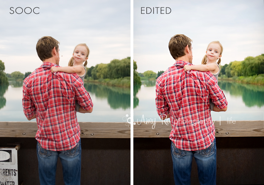
I thought I would do a little B&A on here again since it was well received the last time I did it. I am using one of the pictures from my last session in Chicago up at Northwestern University. First, I loved this location because of the colors of the pond behind them. The trees, the water, the sky, it was so gorgeous. And dad’s red shirt really popped against the green. I have photos from the opposite side of the bridge but that was sandbar and a greyish Lake Michigan. This was gorgeous COLOR. 🙂 Part of it is about finding locations where the light is awesome and the colors are rich and using it to your advantage.
On the left is my SOOC (straight out of the camera) image. You can see it was pretty decent to start with, just needed a little something to draw out the colors and brighten it a bit. Not to fix it though, that is the key. Never fix. Just enhance. This was shot with my 24-70 at ISO 200, 1/320, f/2.8. On the right is my fully edited version of it. Really, there is a change but nothing too dramatic.
In my RAW window I upped the exposure by +15 and slide my recovery slider over to 20. That was it. Then I opened in photo shop.
In Photoshop, I first edited out the bug between their heads and cloned out the sign. Then I ran my regular workflow action. This consists of a levels layer, a basic boost action which has a screen layer and a slight saturation increase. It also increases the contrast a smidge and burns the edges of the photo. Each of those layers is then used at about 20-30% opacity, the burn layer at about 60%. The last step is an unsharp mask at 75/2/4. After that was flattened, I did a curves layer where I pulled up the middle of the curve very slightly and pulled the bottom left part of the curve down slightly. Then changed the mode to luminosity (to avoid wonky skin tones that can occur with curves). Then I used a sponge to bring a little more color into the trees and was done. From start to finish less than two minutes.


Beautiful! Thanks for sharing!
Love it! (tho, I am still looking for half of those things in my Apple software 🙂 )
love before and afters…and I love this shot!
Looks great!
Thanks so much for sharing your steps – I always love to see a before and after from a professional.
gorgeous edit!