Before & After | Rhode Island Photography
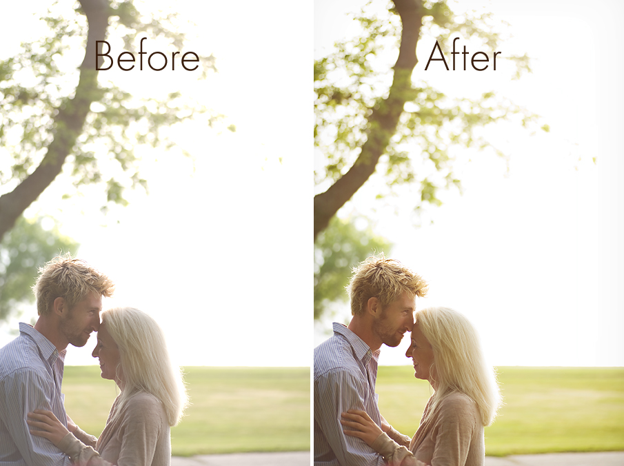
I often have people ask me how I achieved a certain shot. Now I will be honest – some shots take a lot more work in the editing than others! But I thought I would do a little before and after of an easier one to show you what I did for a shot. I’ll try and do this a little more often. It’s fun! 🙂
For the first, shot, a picture of Jane and Brian whose GORGEOUS couples session I shot Saturday evening out at Colt State Park. The technical details:
6:05 pm, D700 with my Tamron 90mm lens
ISO 100, f/3.2, 1/500
Behind them was open air fields with the bay and sky. I wanted that gorgeous golden sunlight that was surrounding them. In terms of composition I positioned myself so that they were in the bottom corner of my frame and the sun was in the top right corner. I wanted a lot of what is called negative space in the shot (part of the frame that doesn’t really have any detail) to give it the feeling of peeking in on a moment between the two of them. I shot more into the sun because again, I wanted that flarey-goldeny-glow. It wasn’t directly behind them, but it was to the side and behind them. I didn’t want any details behind them other than the tree to give the shot some quiet intimacy. Their positioning was all them. All I did was tell Brian to sit on the wall 😉 It’s just about waiting for the right moments that you see.
On the left is the SOOC (straight out of the camera) version, on the right, the finished version. What I did is below the photo. Honestly, when I opened the file, I didn’t want to touch it at all because I loved it. I loved the haze, the everything. But I decided it needed just a little bit of “finishing” to it.

In my RAW window, I brought down exposure -.10, recovered a little bit of detail and brought down the brightness by about 15. I could have adjusted the white balance there but I chose to save it for photoshop.
Then I brought it into photoshop. I ran my normal workflow action which uses levels to bring up midtones and bring down shadows, then a screen layer at 30% to brighten it up a little along with a slight defog to give it a little more clarity. It also runs a vignette around the edge of the photo. Once that was done, I used a color balance layer to add some warmth to it. I added yellow, a little bit of red and a smidge of magenta. Did a very slight s-curve, ran an unsharp mask and done! Less than two minutes of editing from start to finish.

amy this is beautiful! thanks for the great info!
Love this! And I love that you give a little peek into what you were thinking, too. Not just a strict before & after. I hardly use PS for anything (just Lightroom) because I don’t have a good feel for what to do with it yet. So things like this are really helpful!
Love this!