Photoshop Friday | Rhode Island Newborn Photography
I have done this before but it’s been a while! There are SO many actions out there for people to use when playing with pictures nowadays, I feel like it is almost going overboard with what is available. I will admit I TOTALLY played with actions when I first started!! And there is nothing wrong with playing with them especially when you are learning editing or just having fun. But good, clean post-processing is really what you should be going for. Get a really good grip on that and then play. Don’t slap an action (or five) on a photo that is “eh” and think that is editing and call it a day 😉 I am going to share a before and after with you on one of my recent newborn shots to take you through how I post-process a photo.
First we have the straight out of camera shoot (SOOC). This was shot with my d700 with the 50mm 1.4g lens. Settings were ISO 200, f/1.8, 1/640. For lighting there was a window camera right and one camera left. She was placed at a 45 degree angle to the light that was coming in. I intentionally slightly underexpose the baby when I am shooting on the cream blanket because I know it is easier to bring up the exposure on the skin then to try and fix a blown white in the blanket. At the same time my goal is to try to expose both as equally as I possibly can. I don’t want to have to drastically edit! As you can see though, this is really not bad for SOOC. I would have no problem showing this to a client right as it is, before any edits were done. That should be your goal. Always.
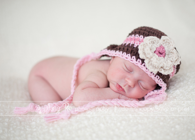
(Side note here, she was a bit red because we had the house warm and I had the space heater on as well and I had her laying on her side for previous shots. If she was normally just a pink / red baby I wouldn’t worry about the red too much.)
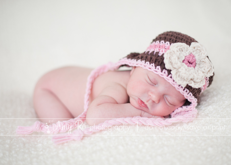
The first thing I do is open the image in Adobe Camera RAW. (I don’t use Lightroom. I don’t understand Lightroom. When I did try to use and understand it I discovered I really don’t like Lightroom. So don’t ask me what to do with lightroom. 😉 Bridge and Photoshop are my true loves and I am faithful to them.) Anywho. Back to this. The only changes I will make in ACR: increase exposure by .25, slide recovery slider to +10 to recover any details in that blanket that may have been slightly blown when I increased the exposure and bring blacks down to +3. Outside of that main window the only other change, because she was rather red as stated previously, is on the luminance tab I increased the luminance of reds to +20. Here is what it looks like now:
Then I open in Photoshop. I discovered after a few years of playing that there were certain steps I ALWAYS took to edit a photo. I really like clean edits. I don’t like a lot of actions. I don’t like when people/scenes look fake or plasticky or wonky colored. Yes, sometimes I will go for a different processed look *if I think the image calls for it* but regularly, no. I have very clean edits. I want the end product 97% of the time to be as if you are looking through a window at someone. But back to what I was saying. I discovered there were things I always did. So I made my OWN action that used all of these steps. (By the way people always ask me for specifically what exactly my workflow action is – it makes no sense to tell you because what works for me will not work for you. Discover your true editing style and go from there!)
For newborns, after running portraiture on a duplicate layer, lowering the opacity to 30% and erasing back all details, I run that action. For ME, that involves:
- a levels layer to bring depth to tones
- a slight add of contrast and a tiny pinch of saturation
- a slight vignette on the outer edge of the photo (NOT black or white but a simple darkening of the colors that are there to draw the eye inwards towards the lighter parts)
- An unsharp mask
Once I have run my workflow action, it is left unflattened and I go back in and erase back anything that has been adversely affected by the edits. Blown whites or other colors, etc. Once I did that for this image I still needed to pull out some red using a selective color layer and then did a color balance layer to add some yellow because it was a bit cool. I also spot edited out a few small flakes of skin and the slight stork’s bite on her eyelid. And this is my finished product: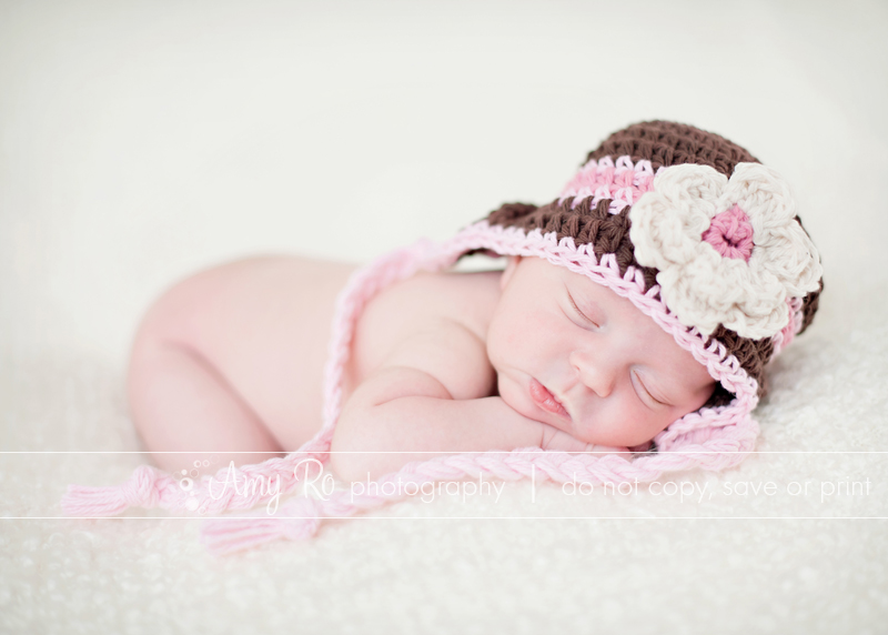
This entire edit from beginning to end takes about two minutes. That’s it. The really important thing to realize though is that I started off with a really decent (in my humble opinion LOL!) straight out of the camera shot. You should never have to *fix* photos in photoshop or whatever program you use (except obvious things like cloning out wrinkles or a random spot). You should only be enhancing what is already there.
Bigger Really IS Better – Version 2.0 | Rhode Island Photography
First let me say, please feel free to share this post. And trust me, read what I’ve written to go along with it – it will make much more sense. And be more fun(ny).
**This post does assume you have wall space to put photos on. If you are limited in space you are limited! Nothing wrong with that. But don’t put one photo up – do a collage of a bunch of photos and frame them up – really make that visual impact even if it’s in a small space!!**
In December 2009 I sat down late at night to write out a post. It started out with me wanting to talk to clients about how to go bigger when they were ordering prints for their home. Then I got all sorts of ambitious and created an entire gallery of images displaying different wall sizes. But the point remained the same:
Get clients to understand that BIGGER IS BETTER when they are printing for their walls
But even now, fourteen months later, it’s still not really happening. But the reason why was hammered home for me when I did my first in-person ordering session with a client. She had no idea how big and small prints were in real life. You hear one size and the picture in your mind is sooooo different from reality. I had brought along a 5×7, 8×10, 11×14 and 16×20 to her ordering session. She couldn’t believe the 8×10 was so small – she was sure that was a 5×7 size. (By the way once she was showed the sizes she ended up with a 16×20 canvas and has already mentioned she will probably wish she had gone bigger!) It really just sank in for me – unless you handle big prints all day long and see them a lot, you’re not really going to know what is what and how big things *really* are. So I am back this fourteen months later with a new version of the post using a traditional print-hanging scenario. You can check out the old one by clicking HERE
You have a family photo session. You spend hours shopping for and debating over what outfits to put everyone in. You email your photographer to get his/her opinion on clothes. You stress over whether it is worth the meltdown to make your daughter wear her pretty shoes instead of her converse. You email your photographer and worry about where to have the session and about the time of the session and whether or not the kids will give themselves a black eye the week before. You convince your husband to actually appear in the photos with you guys. You do SO much to prepare. So where is the thinking about what comes AFTER the session? You know – the ordering part. If you are going to spend all of the time and money preparing and then hundreds, if not thousands of dollars afterward, don’t you want something that makes you *happy* when you look up at the wall? Don’t you want gorgeous awesome big reminders of that session you sweated over?
There are two versions of prints when you order or when you print for yourselves if you buy digital files: desk prints and wall prints. Those are what they mean – prints that are sized to go on desks, and prints that are sized to go on walls. Nothing smaller than an 11×14 should ever go on your wall. EVER. Sorry, it’s a truth you might not want to hear but it’s really for the best. Unless you’re doing an arrangements of a few 8x10s together, set the hammer and nails down and walk away! Trust me, you will be so, so happy you did. Plus, remember all of those horrid awesome posters we all decorated our college dorm rooms with? Those were all 24×36 and we never hesitated to put those up!! (Okay, *I* didn’t…)
Here is a nice layout of prints I put together for you over my stunning cream and striped couch that came with the house (don’t be jealous! Oh and don’t envy my ability to hang things at a special crooked angle). For size reference, this is a regular full sized sofa, right around 84″ wide. All the same image (Ashley I really, clearly love your family 😉 ) and obviously all different sizes. Can you tell which is the 8×10?
SURPRISE!!! Not one single print up there is smaller than an 11×14. Really!!! Here is the same photo with the image sizes labeled for you:
Now that you’ve seen that – want to see what it looks like with the wimpy little 8×10 and 5×7?
And labeled just in case 😉
Now, this doesn’t have the exact same impact when they are all arranged in a group. So let’s take them one at a time. Imagine you have your session. You have a wall over your couch. Or in your dining room, or your bedroom, etc. You have regular 9 ft ceilings and something to hang the prints *over.* So you say to yourself – “Self, I want a BIG print to hang. I know, let’s do an 8×10!!” (By the way, I love Rhode Island, but seriously guys – the concept here that 8×10 is a “big print” just slays me.) Okay. Here is what that scenario looks like:
—
Considering all of that wall space and all of that furniture underneath there, the overall effect is kinda wimpy, huh?? Well guess what. I tricked ya again. I know, you really should expect it by now. 😉 This is an 11×14. Want to see what one measly little 8×10 really looks like? No fooling this time. This is what an 8×10 “big print” looks like on a regular wall over a regular couch:
Yeahhhh. Not so good. It is completely overwhelmed by the wall and the furniture and totally disappears. So let’s step that up. I have already shown you the 11×14. That is the *minimum* size that should go on your wall unless you are doing a whole grouping of images. So let’s go back to that conversation you were having with yourself. “Self, we want BIG. The 8×10 was teeny. The 11×14 wasn’t much better. Dare we try a 16×20?! NO, no, no! A 16×20 is huge!! We can’t put that on our wall!” Let’s see about that:
Again. Taken in context with the whole wall and the whole couch, it’s not really that much. It’s actually quite nice. But in the whole room, it’s still small. SO let’s be super bold and daring and try the ::gasp:: 20×24!!
Now THAT is a nice photo!! It fits well on the wall, it fits well with the scale of the furniture and the room. I’d be really happy if people got that size. Just for fun, though, let’s look at the 24×30. Slightly bigger, yes, but I have to say that this is the size I would go with!
For a slightly different visual where you can see how all of these line up comparatively, I stacked them all together at the same bottom left corner. And then I put them next to my 15″ laptop. This is a normal sized laptop that a majority of people out there have:
You can really see from the 5×7 to the 24×30, how they compare and how there is such a drastic difference. Left to right again – 5×7, 8×10, 11×14, 16×20, 20×24, 24×30
Now let’s pause here for a moment and be 100% honest. No matter what I write here, no matter how much I try and convince people, a majority will still be put off by the last two sizes. I have had a handful of clients go this big and it was awesome. But the rest, they stop at 16×20. (Though I have had several come back to say they wish they had gone bigger… I digress.) Most people will not go bigger than a 16×20. It scares them. So to those people who it scares (and why is that, again??) consider doing something different – one bigGER photo surrounded by smaller ones. Here are some of my family photos from last year, arranged over the couch for a different look. It still makes a visual impact, but because the biggest print is *only* an 18×24 and I have surrounded it by four 10×10 prints, it is less intimidating.
But come on, you know me, right?? (Okay, most of you – some of you are new to me I am sure so, welcome!) That display up there so would not be enough for me. I look at that arrangement and go, yeah, that’s nice. It’s pretty but it’s not enough WOW. I want that WOW factor in there when people walk into my house. And I love my family. I love my family pictures. They make me SO happy to see and I want them big. So this is what has replaced my old collage over the couch. One gorgeous 20×30 gallery wrapped canvas flanked by two 18x24s. (For those curious, the prints are mounted on white foamboard and I used strips of velcro tape to attach all of the prints including the canvas to the wall because it’s an outside / cinderblock wall.)
It doesn’t look that huge does it? Yet just hearing the sizes probably made you shudder a bit. Admit it! 😉 Now here is a little secret – I wanted to add the 10x10s onto the ends – two on each. But I thought my husband might faint. You see, he’s kind of like a lot of you. He likes the idea of big prints but when I got the boxes and unwrapped them I did notice a bit of blanching in his face. I tease. Kind of. When you unwrap an 18×24 or a 20×30 or even a 16×20, it is a scary thing.
But then you put it on the wall and all of a sudden, you realize hey, that lady was right! Bigger really IS better!!
😉
Ten on Tuesday | Rhode Island Photography
1. Ahhhhhhh does it ever feel good to get back into the swing of things. This time last week I was writing about how I was still on vacation. Fast forward to today and I have done two newborn shoots and have another one this weekend. I love it. I missed it. A lot. Of course I didn’t miss the pressure (that, admittedly I totally put on myself) that comes with editing a session, getting sneak peeks up, etc. But oh did I ever miss shooting. And snuggling little tiny ones….sigh. They smell so good and they are just so squeezable and lovable. Even if they are pooping on my new white shirt which I just bought… But I digress. I am BACK, baby. Okay. Kind of. I go on vacation in two weeks and only have a few newborns on my schedule. But I am back. It’s a new year. And I am SO ready for it.
2. I want a new camera bag. And i know somewhere, if Matt is reading this (which he totally isn’t) he is rolling his eyes. I just got my gorgeous Jo Totes bag which I love love love love love. But that is my pretty bag. My take-it-to-my-clients-house bag. And it’s occurring to me that we are moving out of the phase slowly (very slowly judging by the 12-16 inches of snow we are getting tonight/tomorrow) and I will need a bag for running around the park. And my equipment has now outgrown my beloved Lowepro Slingshot 200. The mindless easy way would be to go to the 300. And I’ll probably do that. But I’m only 5’4″ and that bag might be half as tall as I am…perhaps I should look around some more. Any thoughts?
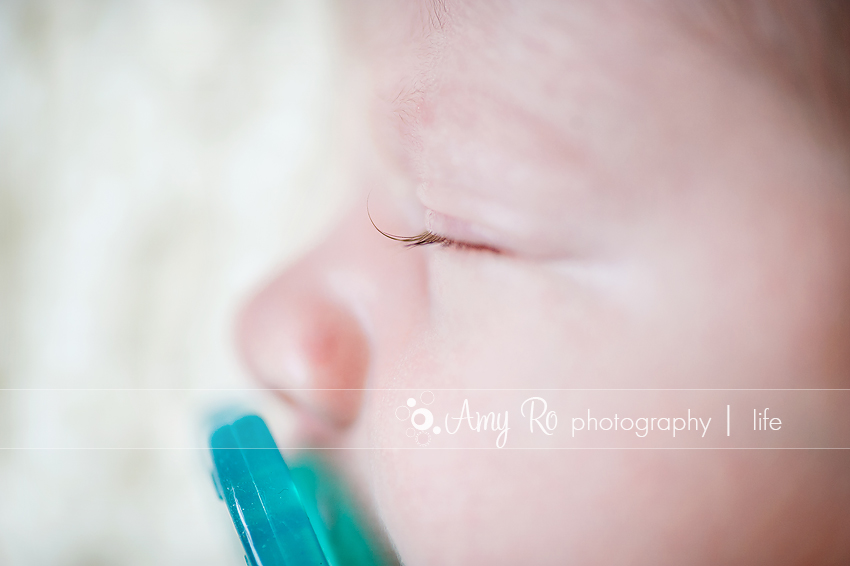
3. I love love love this shot from last week. Yes, that is a soothie in her mouth. She wouldn’t give it up. But I love the little curl of eyelash. She had the most gorgeous curling lashes. And I just love capturing that little teeeeeeeny tiny detail.
4. My favorite time of the year has started. Big East basketball season. If you know me, you know I love sports. Especially college basketball. LOVE it. And I am a Big East girl so it is very close to my heart. We may suck in football but 7 teams in the top 25 consistently in basketball, we will take your conference on any time. 😉 But every night, I sit on the couch with my laptop working and I have a game on in the background. So exciting!!!!
5. I have a new website that I have a feeling I will be addicted to shortly. Pinterest.com. I started seeing it appear on my Facebook Feed and didn’t know what it is. But then other friends started talking about it so I joined. Oh My Gosh. A virtual pinboard of inspiration. Anything you see online you can “pin” it to your board. I have one for inspiring photography, one for food and recipes, one for house decorating ideas, one for clothing and another I am blanking on. But it’s a giant inspiration board and I love love love it. Right now I am just loving looking at all of the people I am following on there and their boards – some of my friends have AMAZING taste. But check it out. And then ask around for invitations from people. I guarantee you will be addicted, too. 😉
6. One extra. I have made it a personal goal to get to 2000 fans by June on my Facebook Business page (click HERE!!!!) That is roughly 420 more fans between now and then. It’s ambitious, but I hope think have no doubt I can do it. (I think I can, I think I can!!) So go fan me, tell you family and friends to fan me. I provide pretty pictures and funny commentary. Really, what better way to brighten up your Facebook feed?? 😉
And this week’s questions:
7. How did you get into photography and how long have you been doing it?
I started taking pictures when I was young – probably under ten? My dad had a film SLR that I thought was just amazing. And then of course my mom had the long skinny 35mm camera. The one that looks like a flat rectangle – I think we all had them in the 80s. I started then and just kind of kept taking photos! I have been in business for 3.5 years now. 🙂
8. How do you archive all of the photos you take – for clients and personal ones?
Everything goes onto two separate external hard drives as well as a DVD. Then I print as needed from there which, for my family photos, I admit is very rarely.
9. How did you meet your hubby?
When I was at Syracuse I was in the marching band in the colorguard (flag). Matt was also in the band at UConn (trumpet). I belonged to the sorority associated with the band, Tau Beta Sigma and Matt was in the fraternity at his school, Kappa Kappa Psi. The two had conferences together several times a year and we were in the middle of nowhere in Clarion, PA when I saw him across the room in his plaid flannel. (It was the 90’s, remember) I said to myself “I want to meet HIM.” So when he showed up at a party a few weeks later in Syracuse I made sure I did 😀
10. What’s your favorite day of the week, and why?
Thursday!!! I know for most people it’s Friday but Thursday is Matt’s day off of work so I get to spend the day with him at home and the kids are guaranteed time with him. We try to have breakfast together after the kids have been dropped off at school. Our original goal was to try a different diner each week since Nolan is egg allergic and we never ever get to go out to breakfast, but I keep scheduling sessions on Thursday that prevent us from going. Oops! Then when Nolan comes home in the afternoon I have extra work time because Matt is home!
11. Do you have an all-time favorite photo?
You know, I really don’t! I have a few that are special to me but nothing where I am like “wow, this is my favorite EVER.” I think I suffer from the same thing a lot of photographers do – I love my work when I shoot it. And then when I look back on it in two weeks or two months I hate it. Not hate. Hate is a strong word. But I don’t like it as much and I can only see what I did wrong. I guess for that reason if I had to pick a favorite it would probably be a landscape photo because I could find the fewest things wrong with it that bugged me 😉

Amy Ro Photography specializes in beautiful on-location, lifestyle maternity, newborn, baby & family photography. Based in Cumberland, RI and serving clients in Rhode Island and select areas of Massachusetts & Connecticut, including Foxboro, Wrentham, North Attleboro, Bellingham, Milton, Natick and all of the south shore area into Boston. Sessions are also available in Avon, West Hartford, Farmington, Newington, Madison and Guilford, Connecticut as well as shoreline towns throughout Eastern Connecticut.


